
What is Sweet Show?
Initial problem and key objective
Key challenges
Issue #1
Issue #2
Solutions and product innovations
New subscription plans
Product innovations: spaces and the content library
The pivotal metric
An important revelation
Product iterations and continual improvements
Product marketing
Impact and results
I joined the Sweet Show team in mid 2020 to lead Product Marketing.
In close collaboration with the small outbound sales team, I initially focused on developing a clear cross-channel client acquisition strategy.
Quickly, though, Sweet Show's business focus turned to a full redesign and redevelopment of the product. My mission moved away from an acquisition focus, towards product design and building out a product-led growth strategy.
With an effectively entirely new product came an entirely new business model for the company.
This case study retraces Sweet Show's product and strategic reorientation throughout 2020 and 2021, my role in the move, and the core challenges, objectives, and results that marked the project.
To skip directly to the results, click here.
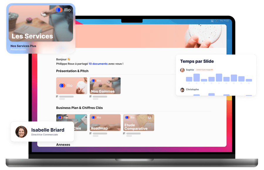
Sweet Show is a Sales Enablement tool, sold as a digital product under a SaaS model.
The product is an online platform where sales teams can centralise all their sales content within a customisable, branded environment. With their documents structured and ready to go, they can run client meetings from the platform, and share their documents afterwards.
Sweet Show's standout benefits come from its client pipeline and viewing statistics tools.
Sales teams can track the viewing data of the content they share. This helps them prioritise their follow-ups, offer more targeted content in future discussions, and overall accelerate their sales cycle.
When I joined the team, the large majority of Sweet Show's new client acquisition came from cold calling and emailing by the sales team. To use Sweet Show, any potential prospect had to go via one of our salespeople, who would work with the prospect to set up their platform, train their sales team, etc.
Over time, this approach wasn't holding up:
Therefore, we quickly identified our key objective: minimise friction in generating new business, and maximise the returns on each working hour for the sales team.
Alongside this transition, we were in the middle of a full-stack redesign and redevelopment of the product.
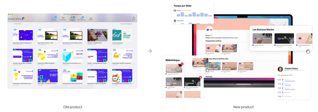
In practice, this meant a shift from the old product: downloadable software installed on sales teams' laptops/tablets, requiring hours of classroom sessions and training; toward a cross-platform web app, with a fully reimagined user experience and product design. Namely, the goal of this new product was to no longer require training time.
To achieve our core objective, we had to develop an all new model for acquisition and client onboarding: self-service.
Any new potential client needed to be able to discover, sign up, subscribe, and get using Sweet Show without ever having to contact the sales team, whether they wanted 1 license or 50.
The decision to focus on self-service surfaced a number of new challenges to solve to ensure a successful future for the new version of the product.
Among these challenges, we identified two main issues to tackle:
What's the best way to design and sell a product with a large variety of use-cases?
Among Sweet Show clients, there's no single typical use-case. Each client company (and each salesperson within it) uses Sweet Show differently. Some are power users of just a single feature, while others use the full span of tools across their entire sales cycle.
A sample of some of the more frequent use-cases:
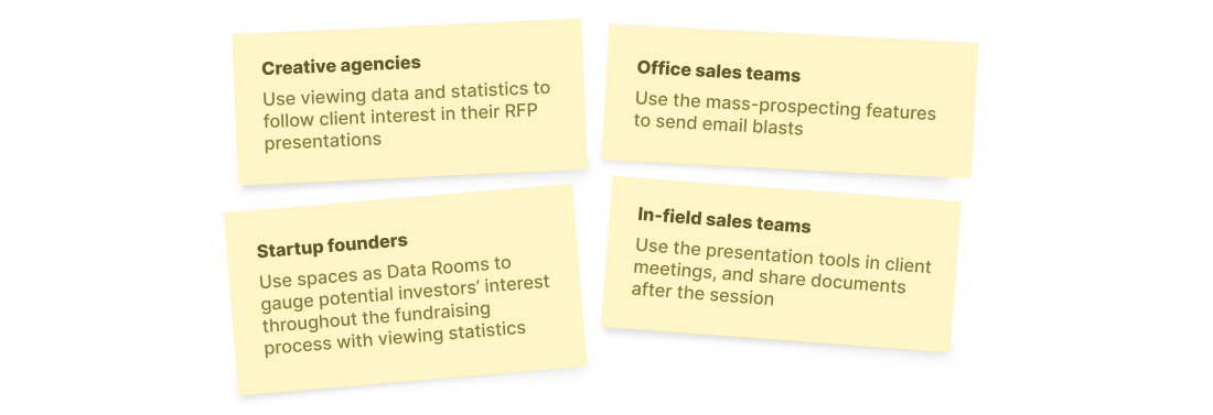
When there's no single main use-case or pain-point among clients, we had to decide how to prioritise the features we'd design next, which ones would get developed first, and which marketing actions would be the most effective to drive traction.
How do we clearly articulate Sweet Show's differentiated vision vs. other solutions on the market?
The Sales Enablement market in France is home to a number of more or less established competitors.
All of these competing offerings share a common thread, one that Sweet Show actively distances itself from. All of them are built on an implicit top-down structure within companies: the marketing department dictates what the sales department does and says — salespeople are expected to sell what they're given, with little room for extra personalisation for each client.
Sweet Show's vision is to balance out this hierarchy.
Salespeople know their clients better than anyone else in the company. Sweet Show believes they should, therefore, have a louder voice when preparing and designing the offers they're expected to present.

How do we best articulate this vision in our external communications, and — even more importantly — execute on this vision, by offering tools to foster collaboration between the two departments?
To solve these issues, we developed a product strategy centered around a full product redesign, to completely reshape Sweet Show in the face of competing Sales Enablement offerings. Underlining these new developments, we laid out a product marketing plan to clearly differentiate the product against the competition.
Previously, each new client contract was negotiated individually, and team training workshops represented a significant part of Sweet Show's revenue.
With the transition to the self-service model, the company was moving away from an effectively service-based revenue model to a full subscription revenue model. This meant that, for the first time, we needed to design and implement individual subscription tiers (priced per user license/month), each corresponding to the main range of company sizes for our various clients.
Solopreneurs and consultants looking to convert more leads and answer more requests for proposals.
This was a new type of client for the company, having always served only larger sales teams.
Sales teams looking to centralise and optimise their mass of documents and accelerate sales cycles.
From this plan, marketing and management teams can share content and suggested flows directly with salespeople.
Large-scale companies with many diverse teams, lacking an effective content collaboration hub for presentations (ie. not Teams, Drive, etc.)
This plan grants access to the Sweet Show API and numerous integrations with other enterprise tools (CRMs, ERPs, etc.) to build on existing internal tech ecosystems.
Each of these plans offers a 14 day free trial.
With our three subscription plans in place, we'd now needed to start work on issue #2.
The core of the new Sweet Show is founded on our new concept of a space.
A space is a fully customisable environment in which users can place and structure all the documents and presentations they'll want to present in a client meeting.
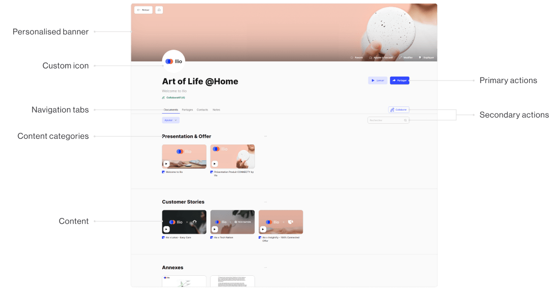
Spaces allow you to rearrange and categorise content in structured flows to easily offer more storytelling-focused and immersive client meetings.
Across our many meetings with large companies with 'traditional' sales teams, a particular challenge kept coming up: when talking to established, traditional sales teams, clearly displaying the added value of Sweet Show for accelerating sales cycles was tricky.
To better demonstrate this value add, we needed to help prospects' marketing teams quickly share their key content with their sales teams. This had to happen without falling into the same top-down structure of our competitors. We needed to let salespeople create their own content flows, in the order of their choice, with the content shared with them by the marketing department.
The solution: the content library.
The content library allows teams to upload and centralise all their content in one place, filter it with tags, and sort it as needed, without having to place it within a space.
This allows marketing teams to upload the content the sales teams need to present, all while allowing salespeople to take these documents and add them into their own customised spaces. This gives the marketing team control over the content being shared, but allows sales teams to structure this content however they see fit.
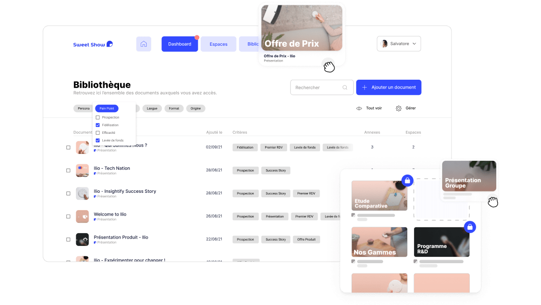
Spaces and the content library served as a strong step toward fostering smoother collaboration between the sales and marketing departments.
While building the new platform, we began onboarding beta-testing clients to get initial feedback on the new product and get it in the hands of real users.
Shifting an entire salesforce towards an all-new tool is a time-consuming process. Convincing all team members of the product's usefulness requires effort on Sweet Show's part, but also for sales team managers within client companies.
During field tests with clients, we noticed a recurring trend differentiating users that quickly stopped using the platform, and those that quickly became frequent users:
Users that shared documents during one of their first sessions in Sweet Show tended to become very frequent users. Those that didn't send anything in their first sessions, on average, didn't become regular users.
Around the time that we began noticing this trend, client feedback was beginning to help us understand that what we thought was the main benefit of Sweet Show — a better client presentation experience — was really not what interested most users. For our users, the viewing statistics were the most used part of the app.
These discussions with users helped us better understand where they were finding the real value within Sweet Show. Over time, these learnings helped us reposition the product's voice and main value proposition: for our users, Sweet Show wasn't a presentation tool, but a document tracking tool.
With this new, clearer understanding of user behaviour, the next step was rethinking the best way to make sure that clients quickly felt this added value during their first sessions.
Previously, our client onboarding was a 1 to 1 experience, with lots of classroom sessions with new users in client companies. The objective during these sessions was to help set up a fully customised platform to quickly get them up and running for their upcoming client meetings.
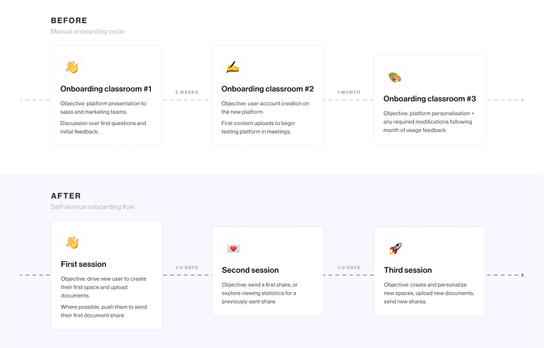
With this new approach, we focused on getting new users to create just one single first space, upload some key documents, and send their first share as fast as possible. Being that clients would now be doing this all by themselves, we needed to optimise this process within the app — no more salesperson to guide them along the way.
To ensure an onboarding experience that would be just as smooth in self-service as with a salesperson (if not more!), we rethought the entire new account onboarding process to drive them to sending a first share in their first sessions.
Previously, over multiple meetings, we'd show off the various features of the product to clients, and work closely with sales management in their company. Switching to a self-service model meant that we lost this systematic link with sales leaders in client companies.
That meant we needed to prove our value from the very first time they opened the app.
Onboarding
To do so, our first mission was to build a proper onboarding experience in the product. When opening a platform for the first time, an interactive user flow now holds each new user's hand through their first steps into the app. The main steps:
Create a space > Import documents > Send a first share
Various flows are presented contextually the first time users discover new parts of the app, to avoid cognitive load upfront.
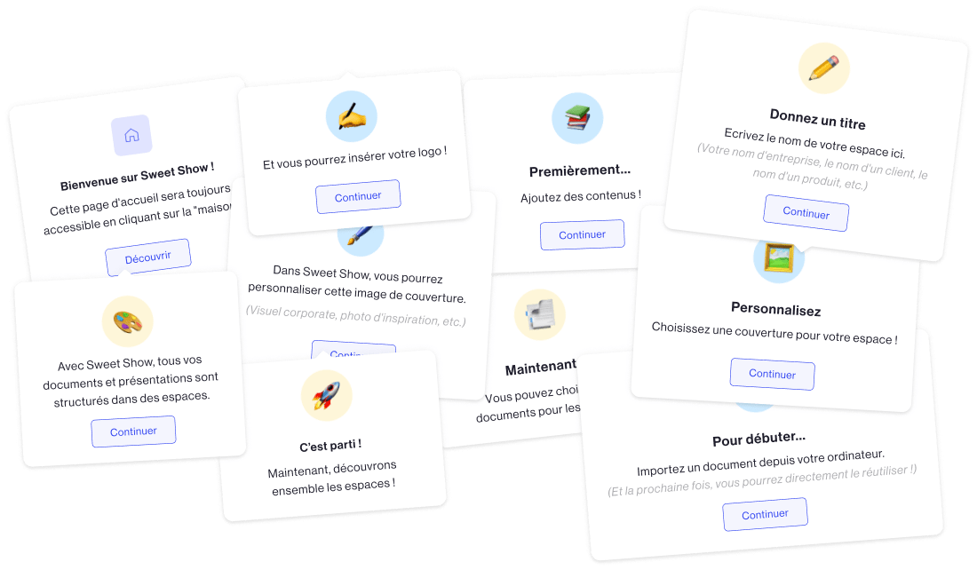
And to simplify the experience further, not all users see the same onboarding flows. Administrators don't need to learn the same features as users, and vice-versa. Separating which features were necessary for each type of user helped us lighten the process as much as possible.
Centralised share dashboard
In our plan to make document sharing a more central part of the app, rather than just a single step among many, we completely redesigned the document sharing suite.
Previously, shares were split up by spaces. Shares sent from space #1 were completely separate from shares sent from space #2. Digging into the statistics for each of these spaces was a clunky experience, as they were both so separate from each other.
To make shares a more central part of the user experience, we needed to rethink their role in the product.
I designed a new key part of the product, a dashboard section to centralise all shares sent from the platform.
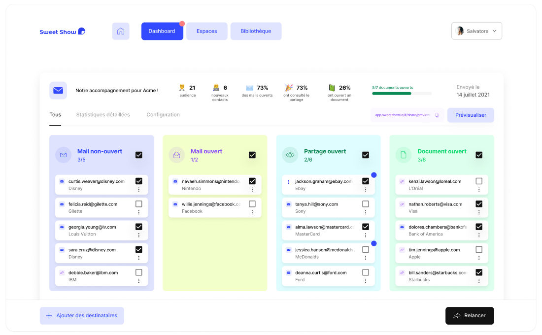
We went from structuring information based on spaces, to structuring them around each individual opportunity that each share represented.
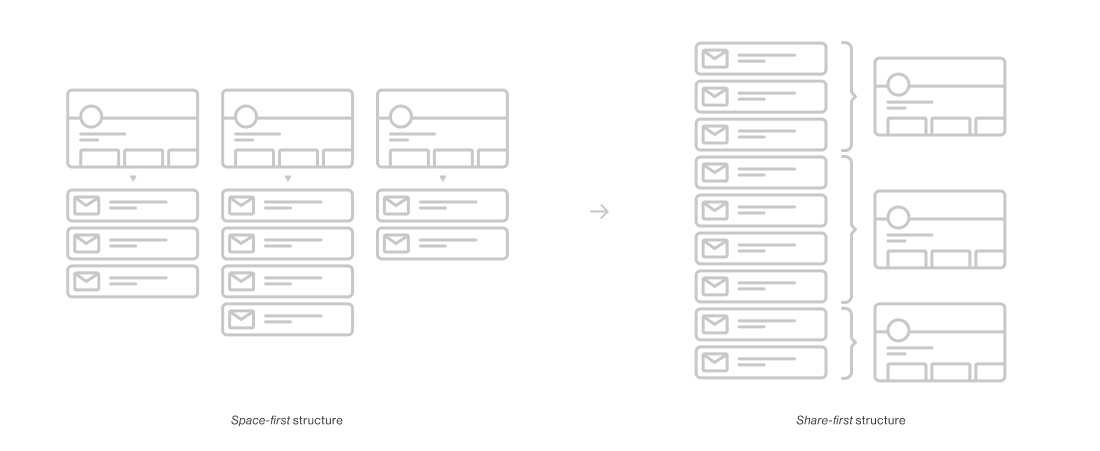
With this new pillar of the app in place, salespeople could now track each step of their client pipeline faster than ever, and send follow-up messages without ever leaving the app.
This new approach represented a major step toward our goal to center the Sweet Show experience around individual opportunities and shares, rather than content and presentations. This approach places Sweet Show at the heart of teams' sales cycles, rather than being just a tool around client meetings.
To communicate our various value propositions to our various target audiences, based on their various use-cases, we needed to tailor our messaging to each audience.
I developed a series of landing pages presenting Sweet Show. Each targeted a different type of user and company, and each page was custom-written to speak specifically to each type of potential client.
A same app feature can be presented in completely different ways depending on the requirements of the audience reading it. The testimonials on each page are selected to specifically resonate with each type of reader, based on the page's target audience.
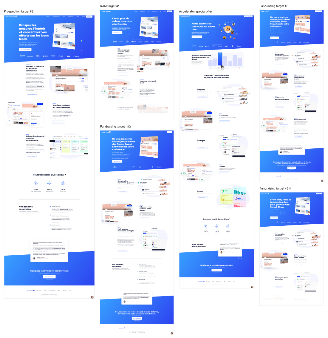
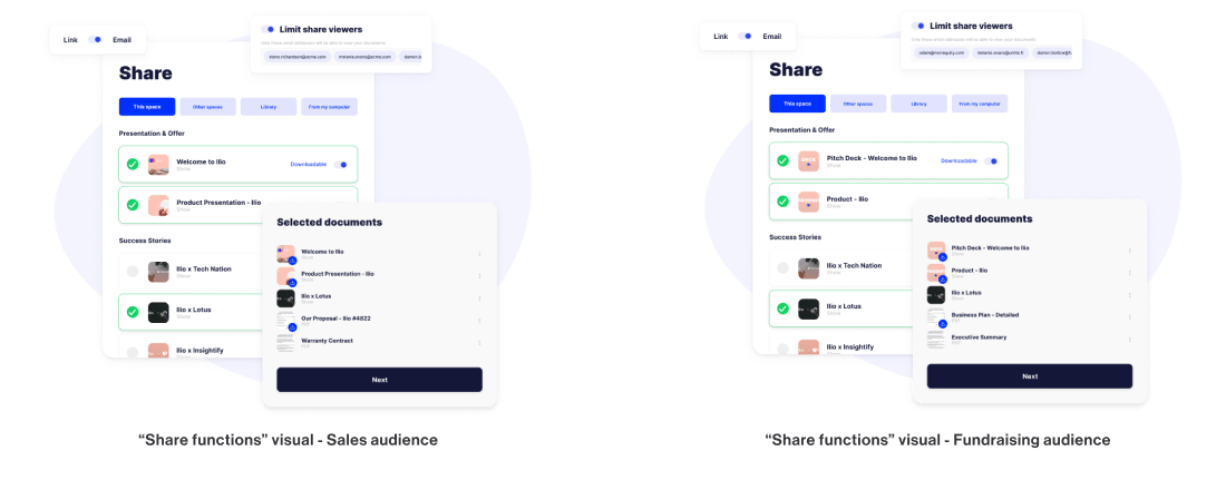
Alongside this tailored copy strategy for each page, I created a wide range of visuals with micro-contextualised information to better reflect the use-case situations of each target.
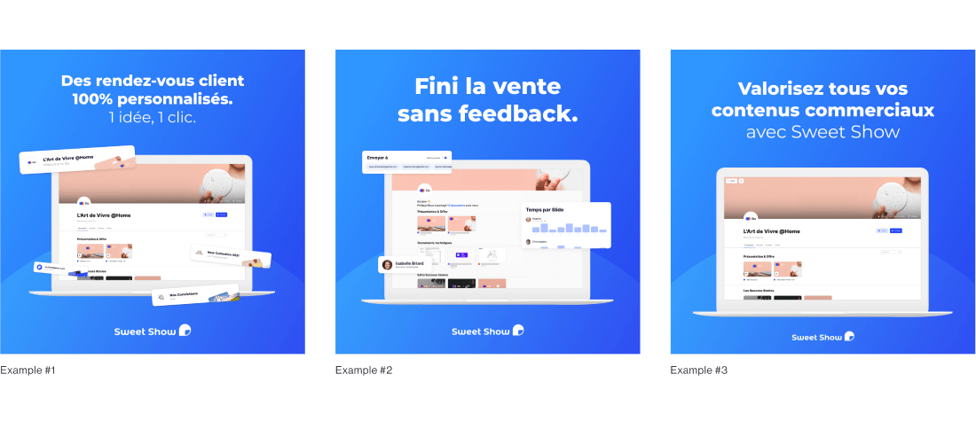
To supplement our organic acquisition channels, I developed a series of Google Ads and Facebook Ads campaigns.
These campaigns, like the pages, were structured to clearly target these different audiences with contextualised messages, tailored to each of their pain points. Some targeting examples:
Each ad led to its corresponding landing page, ensuring a targeted experience and contextualisation for each type of potential new user discovering Sweet Show for the first time.
Thanks to a large database of contacts generated through our outbound selling efforts, I generated a number of high-affinity lookalike audiences for each vertical/use-case to target each ad set. Rather than targeting cold audiences, this approach allowed us to speed up our audience development, by supplying the advertising algorithms numerous profiles as examples of our "ideal" client profile.
Our Facebook Ad campaigns in particular accelerated our new user signups — namely "Solo" plan testers, many of whom went on to promote Sweet Show within their companies.
In alignment with our mission to balance the top-down relationship between marketing and sales departments, this approach worked fantastically to foster a bottom-up adoption of Sweet Show within our target verticals.
Through our transition to a self-service SaaS model, we increased our new user signup rate by over +28%, semester over semester.
The average number of user licenses per company, as expected, dropped slightly upon releasing the Solo plan (and due to not having direct access to sales decision-makers in target companies). This drop, though, was significantly outweighed by the amount of time saved by not having to manually call and onboard each new prospect.
With our shift to a strategic focus on shares rather than presentation experience, we increased the average number of shares sent per platform per month by +37%, semester over semester.
With our push to prioritise email shares in order to maximise the value Sweet Show adds to users, we increased email shares as a portion of total shares by over +13%.