Building the all-new Tan transit app
Project scope
Initial problem and objectives
Identifying and understanding user problems
Two main types of users
Key principles
Product solutions
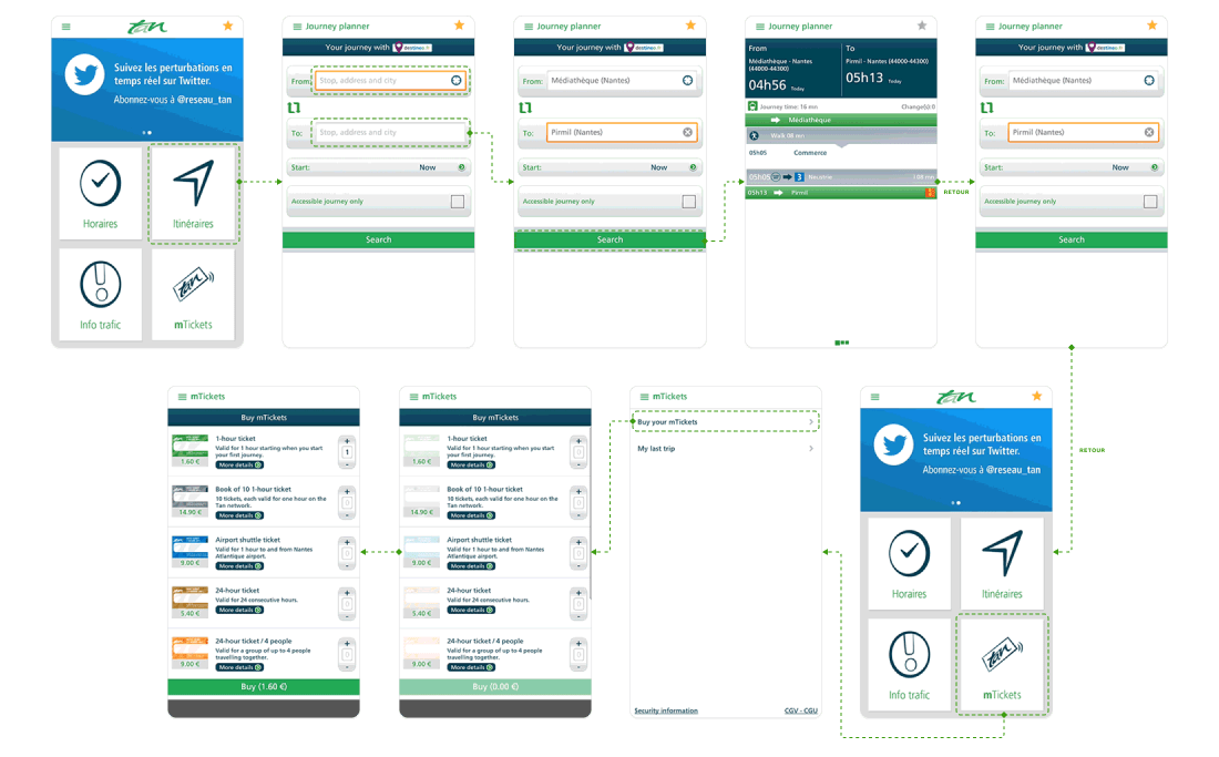
Centralised search
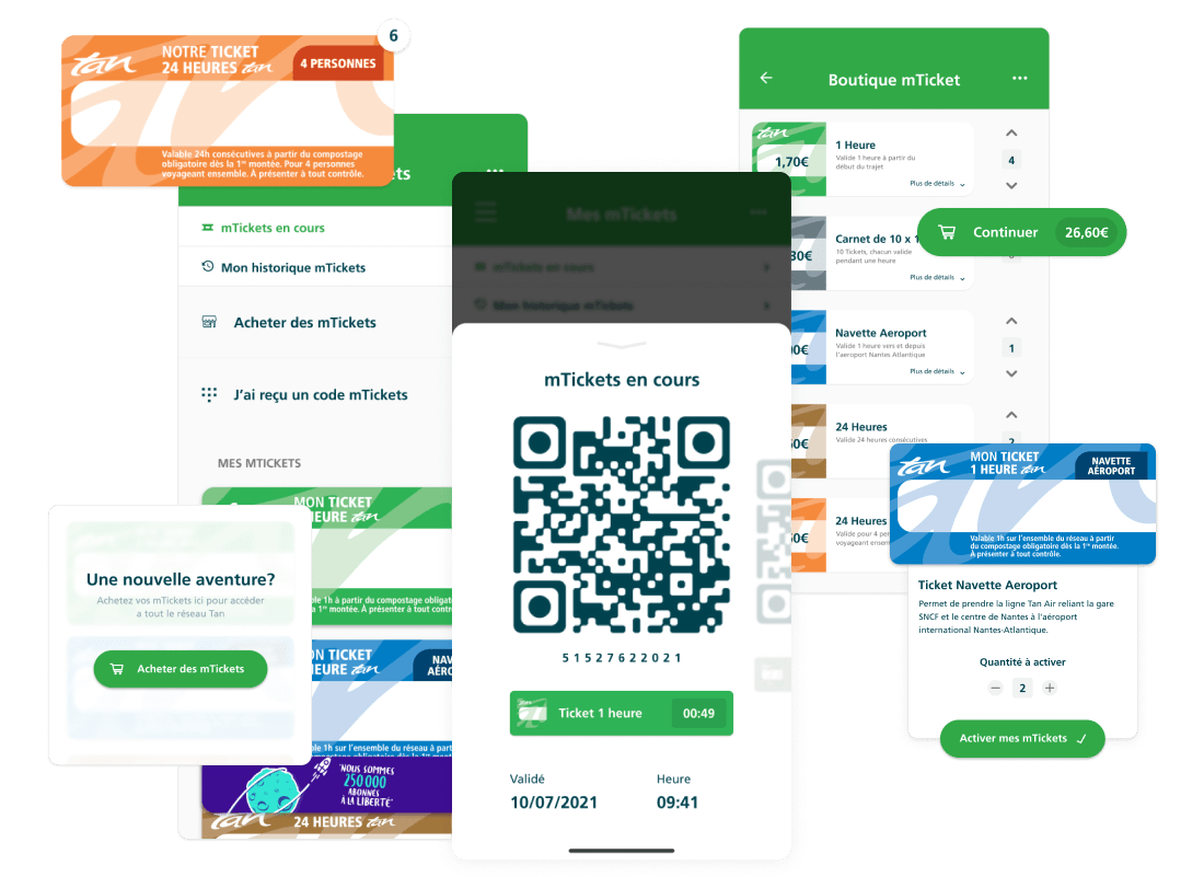
Making mTickets more accessible
The new mTicket wallet
Challenges we encountered
Presenting information
Presenting line variables
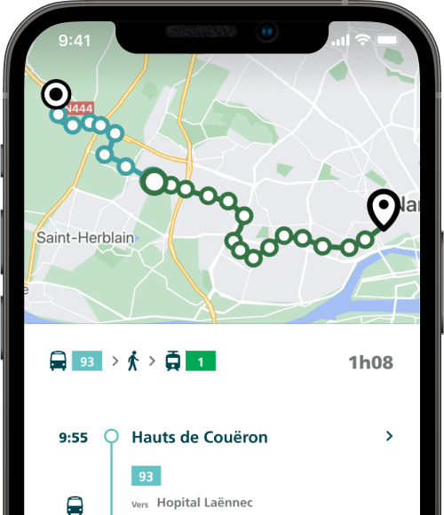
The new Tan app
Tan is the transit network that covers the city of Nantes, France — an equivalent to Paris' RATP. Tan operates a large network of trams, buses and river ferries throughout all of the "Agglomération Nantaise", serving 400,000+ trips each day.
Targeting an official launch for early 2020, Tan was looking to deploy a full redesign and redevelopment of their digital service offerings. The goal was to increase adoption of their mobile application, and improve the digital experience of travellers on the network.
To skip directly to the final product, click here.
I was contacted by Tan to lead multiple projects:
I worked in close collaboration with the Head of Digital at Tan to devise our initial approach and product strategy. We worked with digital agency Niji for the development and implementation phases of the projects.
The mobile app project had many stakeholders, including the president of SEMITAN (the parent entity operating the Tan network), and local government officials. When laying the groundwork for the new product, the mayor of Nantes, for example, made clear her wish to make ridesharing a key initiative in the city's transportation efforts. This collaboration with numerous stakeholders shaped the priorities and decisions made throughout the project.
The population of Nantes Métropole has grown by almost 20% in barely 10 years. This growth is expected to speed up even more in coming years.
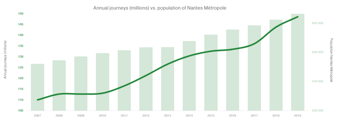
This population growth has brought with it an even faster increase in usage of the city's transportation services.
To accommodate all this new demand, the network is constantly increasing its vehicle fleet, building new lines to serve new districts, and increasing service to many existing lines.
Over time, though, the travel ticket system was becoming increasingly outdated, no longer fit for the growing needs of the network. At rush hours, queues in front of ticket purchasing machines at many stops were getting longer and longer — and tourist season only made the problem worse.
There are three ways to pay for a trip on the Tan network: physical tickets, mTickets, and the Libertan travel card subscription.
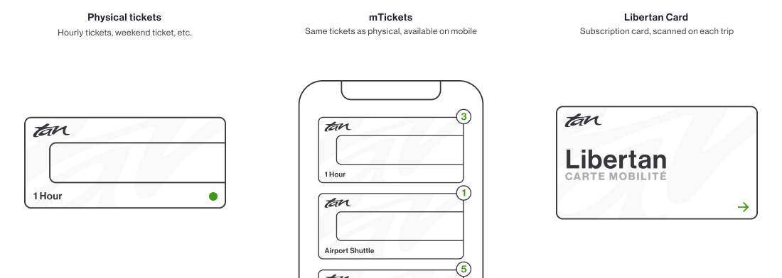
Physical tickets formed a large portion of the tickets used on the network, but presented a number of inconveniences for both travelers and Tan: physical tickets are a constant source of rider fraud.
These physical tickets have to be stamped in an automated machine when boarding a vehicle. Each ticket is to be stamped only once. But short of drivers themselves manually checking each rider's ticket, it's difficult to avoid users re-stamping their tickets multiple times, effectively riding on the network for free as much as they wish.
To answer this problem, and to serve users riding on the network too infrequently to warrant a Libertan subscription, Tan developed mTickets — a digital version of the existing tickets, stamped digitally with the Tan's mobile app.
Despite being a much more practical alternative to physical tickets, mTickets never found much success among riders. Tan believed this was due to their aging mobile app, first released in 2011, and rarely updated after that.
Through the app, you could search for line timetables, plan trips, be alerted of line disruptions, and manage mTickets. But because of the lack of upkeep, the entire app itself was little used — mTickets couldn't do any better.
Our theory: building an all-new, fully redesigned application would help drive mTicket usage, and would improve both frequent and infrequent travelers' experience.
On project launch, around 75% of all searches for timetables and travel routes came from mobile users. A portion of these mobile requests came from the Tan app but the majority came from the network's website — at over 600,000 unique sessions per month.
The app's interface was so user-unfriendly that it was just no longer a solution to the increasingly varied needs of travellers on the network. Users had to visit the (non-mobile-optimised) website to find the required information, as the app just wasn't worth trying.
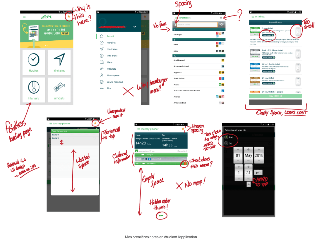
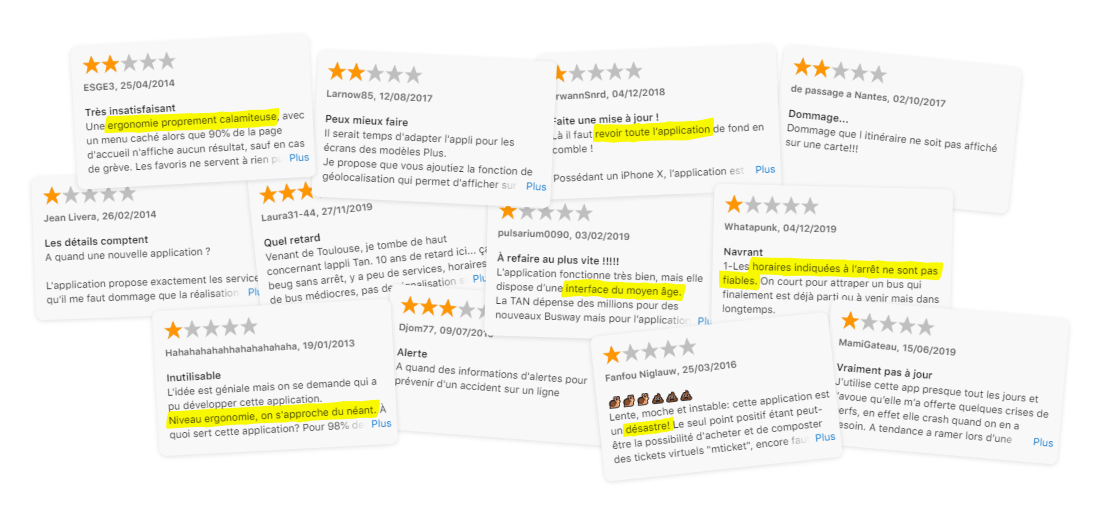
Online feedback from app users offered clear insights into what to focus on when building the new product.
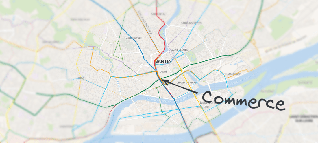
To better understand the most important subjects we'd need to focus on, I went to meet travellers on the network. At the Commerce station, at the very heart of the city where many lines intersect, I chatted with a number of travelers to try to better understand their usage (or lack of usage) of the Tan app.
Through this exercise, I uncovered some of the very different ways travelers used Tan's digital services:
Similarly to the comments on the App Store and Play Store, almost everybody I talked to mentioned the app's UX, and its frequently inaccurate timetables.
Progressively, these discussions pointed to a central issue again and again: people didn't trust the information shown by any of Tan's services.
These chats with a range of users helped me identify the key issues at the heart of the rider experience, and helped me shape new approaches.
Like all urban transport networks, Tan's ridership can broadly be split into two groups:
These two categories of users have very different needs and expectations when looking for information about their journeys around the network.
The first group tends to prioritise speed and ease of access to specific, recurring pieces of information. The second group tends to need more contextual information — before worrying about being sure of when the next bus is coming by, it's helpful to know if you're even looking at the right line!
To structure and orient our product strategy, I defined two principal User Stories, representing the two main typical use cases of the network for these groups.
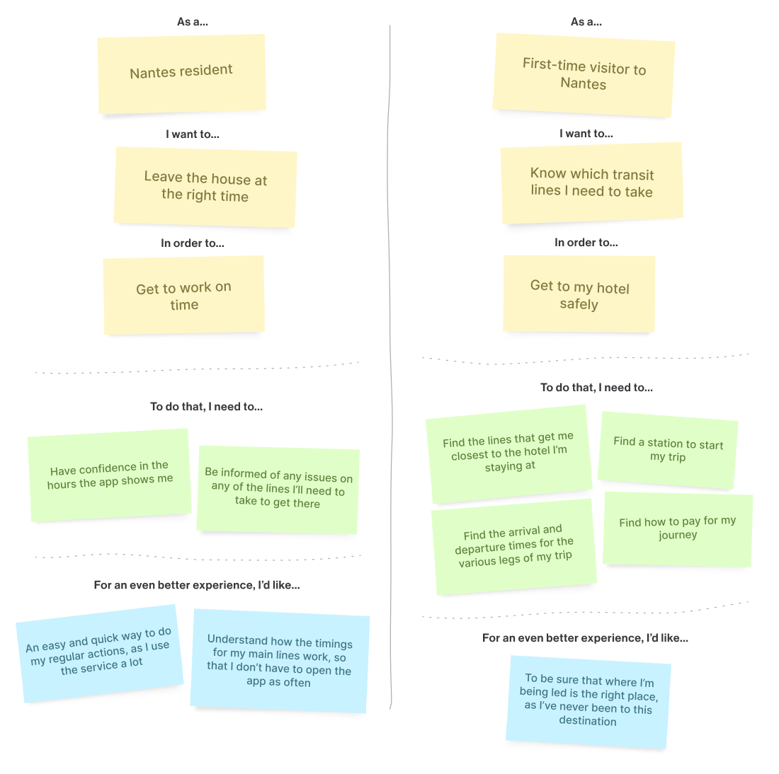
These two stories are examples of frequent usages of the app and the network. They both require much of the same information. But the mental flow users go through in each case in order to find, contextualise, and understand this same information is vastly different between the two user categories.
The required information had to be quickly accessible for the first category of users — frequent riders, all while remaining properly contextualised and quickly comprehensible for the less familiar travellers.
A recurring criticism of the original application was the segregation of data between the different user flows.
To switch from a route plan to a timetable for a given stop, you had to retrace your steps all the way back to the homepage and start a whole new search. At no stage throughout these paths would a user be warned of any active disruptions that could affect their journey — that'd require digging into the "Traffic Alerts" section, it too, segregated from the rest of the app.
With this in mind, a key focus of the project was to interconnect all the various parts of the app as much as possible, simplifying the user experience.
Our leading principle: flexibility.
Users shouldn't have to 'think a certain way' to use the app effectively. The app should be flexible enough to adapt to the various possible use-cases.
Following these learnings, a key focus through the project was to ensure that a timetable-first usage of the app would be just as effective and intuitive as an itinerary-first usage, and vice-versa.
Throughout informal prototype testing sessions with frequent travelers on the network, there was a roughly 50-50% split between users who prefer to look up station timetables to plan their trips, and users who prefer to generate itineraries/route plans for each trip, saving them the effort of piecing together each different leg of the journey themselves.
This lack of consensus on the most frequent way of using the app drove us to make decisions that had to work intuitively for both groups, all while aligning with Tan's long-term objectives.
Previously, when opening the app, users had to choose upfront whether they wanted to look up a timetable, or generate a route plan for a given trip.
We built a solution that avoided making users choose upfront.
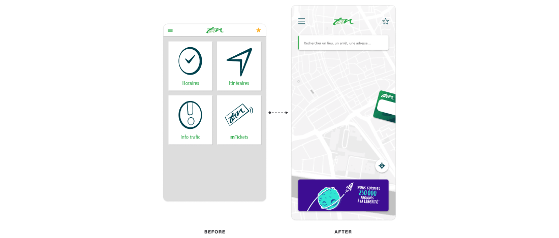
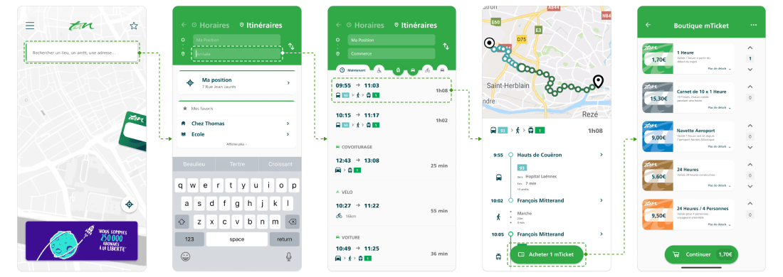
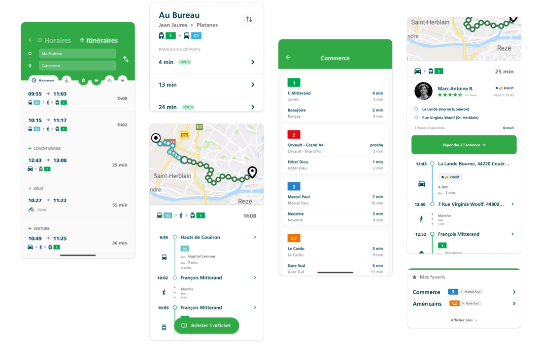
With the new solution, users start all forms of searches by tapping the search bar. By default, this starts generating a new route plan, with the user's current location pre-filled. This removes friction from the search process, and presents first results faster, which can be switched to a timetable search as needed.
Offering a centralised search upfront offers a more intuitive access to the requested information, all while building on the local government's objectives: driving usage of public transport and ridesharing within Nantes Métropole.
Given the rapid growth of the local population, this development also helps optimise the experience for our aforementioned "new to Nantes" user group — not expecting them to make decisions upfront, rather holding their hand throughout the app.
An important question for all new users of transit networks is: "How, and how much do I pay for this?"
In the previous app's UX flow, there was no clear indication of how to pay the required amount for your trip (or even know how much it cost). To buy the required tickets for the trip, you had to exit the search flow entirely, find the required ticket(s), make the purchase, then find your way back to the trip planner (and then back out to e-stamp the ticket!).
We needed to design a fluid way to identify the best route, know which tickets were needed, pay for them, and stamp them. This process had to be easy and fast for all users.
To do so, we redesigned the role of the mTicket system, placing it at the heart of the route planner experience.
In a single click, the mTickets basket is now automatically filled with the right tickets to complete each leg of the trip — no extra research required.
To further make mTickets a more accessible and important part of the app, we designed a way to make them much more easily reachable than before — now visible directly from the home screen, particularly helpful to frequent riders.
Even among the most frequent mTicket users, many only ever purchased just one or two tickets at a time. This was largely due to their not trusting that their bought tickets would stay in the app properly when they came back to it later. Here too, this behaviour was representative of a lack of trust in the app.
To solve these experience problems, we needed to reassure users on the safety of their mTicket wallet, and the persistent nature of mTickets. To do so, we sought to design a new mTicket wallet, more transparent and visually-trustworthy than before. A simple yet important part of this change involved more reassuring copywriting, namely using the word "wallet" more frequently to reflect the safe storage of their purchases.
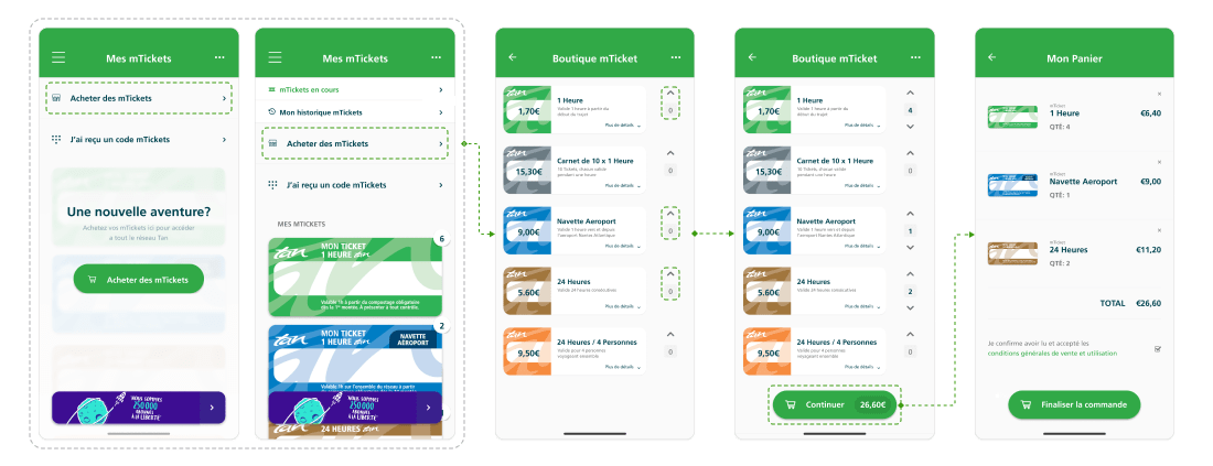
To ensure a clearer understanding and transparency around ticket prices, users are given easy access to the mTicket store without having to create an account upfront. They can fill their 'basket' with tickets and reach the payment stage, only creating an account/wallet to store their purchases at the last minute.
These solutions allowed us to make mTickets more accessible to all types of users, increase their trust in their digital wallet, and prove the value of the entire mTicket system to pay for journeys.
As is to be expected in this sort of wide-ranging and complex project, we ran into a number of challenges along the way.
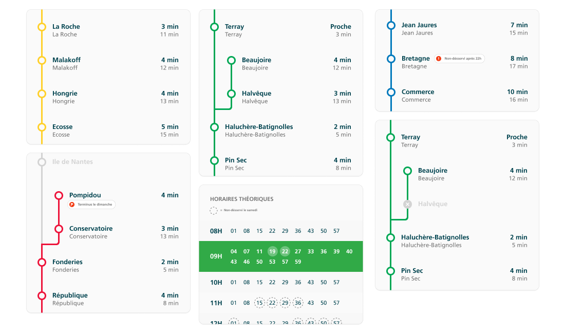
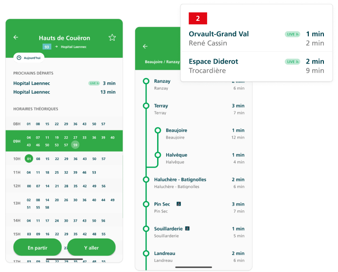
Timetable data (arrivals, departures, etc.) displayed in the app comes from two distinct sources:
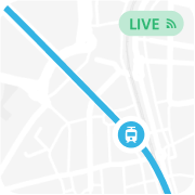
A large portion of the network's fleet does not communicate real-time positioning data to the network and the app.
Particularly at rush hours, it was often the case that the hours displayed in the app didn't reflect real arrival times — often, not even close.
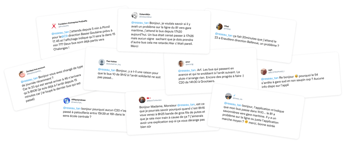
While waiting at a bus stop, you might see a first bus come by — very delayed from the displayed time. Then, a second bus might come by just after — this one, perfectly on time. Finally, a third bus could come by, once again, with a significant delay.
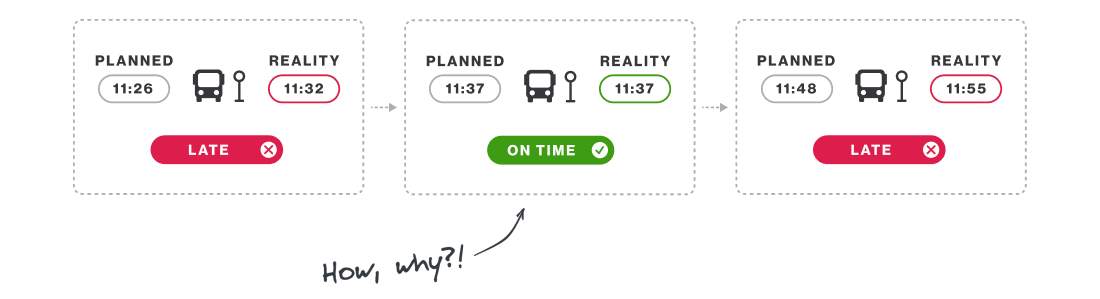
Unsurprisingly, users were often made to wonder why some hours displayed in-app were reliable, while others — for the same line, around the same time — were so far from reality.
The answer: the timings displayed for some arrivals reflected the real-time position of the vehicle, while others did not. The user had no idea whether the displayed timing would be accurate and reliable or not.
We had to decide how to handle this split between the different information sources.

Would clearly displaying which data was in real-time make users trust the app more?
Or, inversely, would it primarily bring attention to all the information that wasn't in real-time?
Our fear was that specifically calling out "These numbers are reliable, but not these ones" would end up net-decreasing user trust in the app.
We experimented with various ways of displaying the live information vs. the pre-planned data, and how to differentiate (or not) the different types of information.
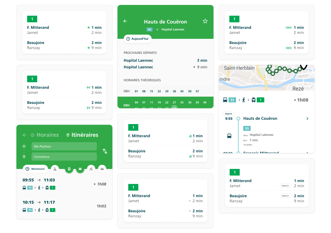
We had 2 real options:
We decided to clearly differentiate the two types of times. Our reasoning: the benefits from understanding why some times were more reliable than others outweighed the risk of losing a bit of trust in the other displayed times.
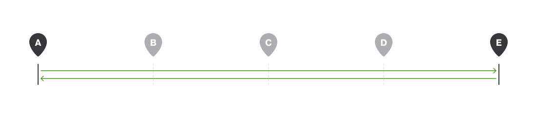
Many of the lines of the network don't run a simple path "starts at point A, ends at point E, passing through B, C, and D, then turns around and serves the opposite route".
Many lines have a different terminus (final stop) depending on the time of day.
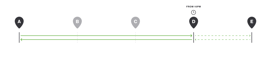
Among these lines, the time at which this terminus changes often varies depending on the day of the week.
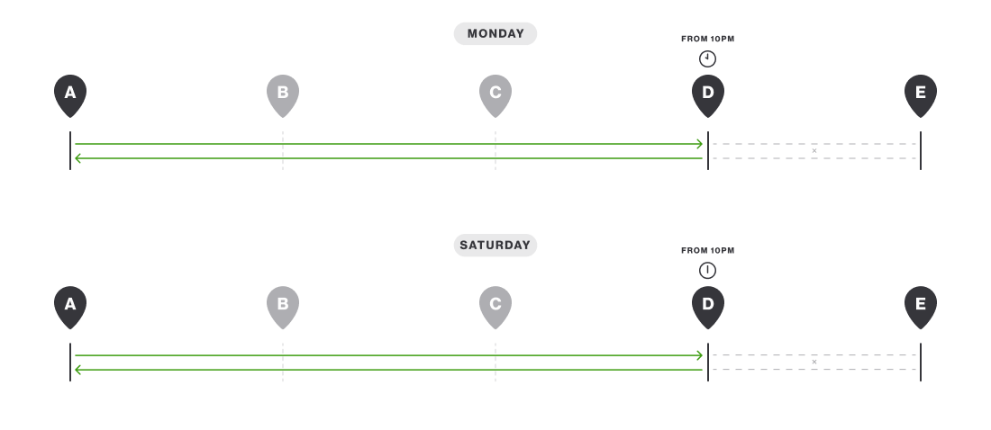
Better yet, depending on the time, the line might not serve some of the stops along the route.
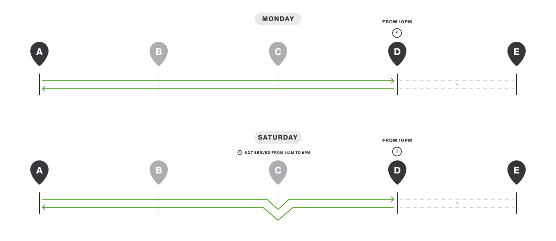
And for each variable in the line information, you can actually double the number of variables, because the line runs in both directions! Do all the modified service rules apply in the other direction too? If not, which ones?
In reality, the full span of possible line service variables is as good as unlimited. This left us with the question of how to clearly communicate all this information visually. And how do we make sure it's always intuitive to people that don't know the network at all?
To solve the problem, we built a library of combo-components that allow us to visually represent any possible line situations, variations, and modified service rules.
This flexible range of components and variables allows the app to adapt how a line is displayed, in order to reflect (almost) every eventuality.
After around 8 months of research, planning, design, development, and testing, Tan announced and launched the new Tan app on schedule in early 2020!
With the Tan app, travel around the entire network with ease.
Identify the best routes by bus, tram, boat, train, or even ridesharing, to get all around the métropole!

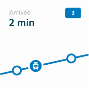
Save your most-used stations, and view upcoming transit options in real time!
Buy and stamp your travel tickets directly from the Tan wallet to cover all your trips around the city!